Checkerboard
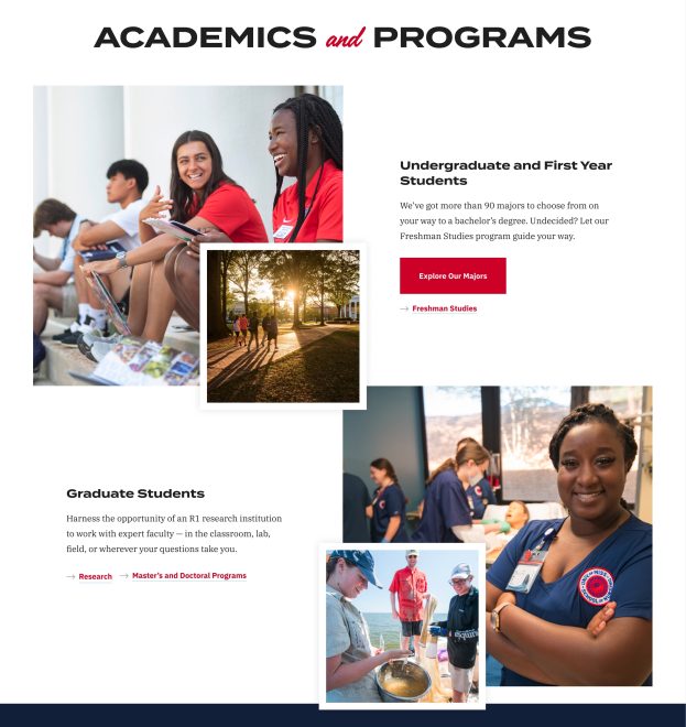
A flexible, multimedia way to showcase important and evergreen information. Can accommodate an image or video, an optional button, or an optional caption.
Purpose
A flexible way to showcase important and evergreen information. Can accommodate an image, an optional button, and an a brief caption.
Usage
School Homepage, Landing Page, General Page, Department Detail, Audience
Do
Use when you have high-impact information that you are trying to steer a user toward.
Use short descriptive text.
Do Not
Use it as a place to house news stories.
Use any other photo sizes than what is noted.
Use for long blocks of text.
Fields
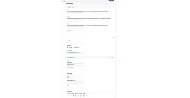
- Section Title
- Front (e.g., “Academics” in visual)
- Text Field – Plain
- Help Text: Text entered in this field will display with black font color. At least one of these title fields (Front, Middle, Back) must be filled in.
- Middle (e.g., “and” in visual)
- Text Field – Plain
- Help Text: Text entered in this field will display with red font color (stylized). At least one of these title fields (Front, Middle, Back) must be filled in.
- Back (e.g., “Programs” in visual)
- Text Field – Plain
- Help Text: Text entered in this field will display with black font color. At least one of these title fields (Front, Middle, Back) must be filled in.
- Front (e.g., “Academics” in visual)
- Description
- Text Area – Simple HTML
- Link
- Title + URL Field
- Large Image (650px x 624px) ★
- Image Upload
- Small Image (320px x 320px)
- Image Upload
- Title ★
- Text Field – Plain
- URL
- URL field
- Description
- Text Field – Plain
- Button [max 1]
- Title + URL Field
- Link [max 2]
- Title + URL Field
Section Features
- If there are multiple checkerboard items, the media and text content layout alternates using CSS.

