Typography
How you use a typeface can impact how the Ole Miss brand is represented. Choose your typefaces with these best practices in mind.
Primary Typeface
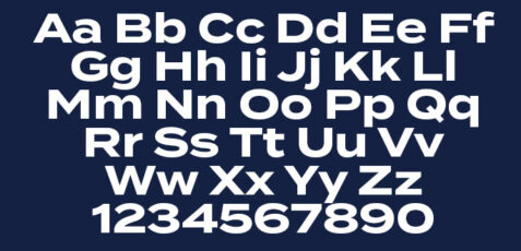
Termina
Used in headlines, subheads, callouts, quotes, numbers, stats, small blocks of copy.
Termina is a strong, expanded typeface that we use most frequently and in a variety of ways. It has clean, simple letter forms with technical precision at lighter weights and holds impact at heavier weights. No italic weights are available for this font. While it can be used as a body copy, the width of these characters is not ideal for long runs of small text. Take extra care with tracking and kerning when used as body copy.
Do
Use with headlines, subheads, callouts, quotes, numbers, stats, small blocks of copy.
Do Not
Use in long form paragraphs, italicize, track or kern this typeface.
Accent Typefaces
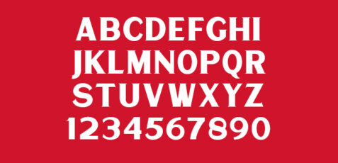
Matrole
Used in subheads, callouts, quotes, numbers, stats
Matrole is an accent typeface with serifs and proportions that feel distinctly Southern. It’s best used with our other typefaces to avoid becoming dated. Only one weight is available and the characters are all caps. This typeface has letter spacing issues, so take extra time for manual kerning adjustments. Matrole can be tracked out up to 600 points when it’s used for small-size callouts, but use normal tracking when at bigger sizes. Never use it for body copy.
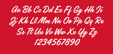
Handelson-one
Uses: subheadlines, key words
Handelson One is a hand-written typeface inspired by the Ole Miss script logo. It adds a more expressive, personal touch to our brand language. It i best used for a keyword or short phrase in a headline or subhead, not long runs of text. Never us the font in all-caps or long runs of text.
Do
Use subheads, callouts, quotes, numbers, stats
Do Not
Do not use it for body copy, main headlines, or as a primary typeface. Never use Handelson in all-caps or as a substitute for the Ole Miss script logo. Never track out Handelson.
Body Copy Typefaces
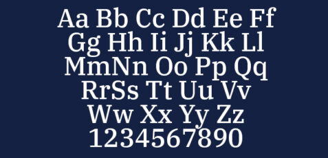
IBM Plex Serif
Used for body copy, small call outs and other supporting copy.
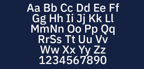
IBM Plex Serif is one of Ole Miss’ two typefaces for body copy (along with IBM Plex Sans). both typefaces should be reserved for long runs of text, callouts, and other supporting copies. They’re especially useful in small sizes and are easier to read than our other fonts. The serif feels more classically academic, while the sans is more sleek and modern. Use only one of these typefaces per piece. Do not intermix them in the same run of text.
IBM Plex Sans
Used for body copy, small call outs and other supporting copy.
IBM Plex Sans is one of Ole Miss’ two typefaces for body copy (along with IBM Plex Serif). both typefaces should be reserved for long runs of text, callouts, and other supporting copies. They’re especially useful in small sizes and are easier to read than our other fonts. The serif feels more classically academic, while the sans is more sleek and modern. Use only one of these typefaces per piece. Do not intermix them in the same run of text.
Do
Use for body copy, small callouts, and other supporting copy. Use serif in more formal situations.
Do Not
Mix the two body copy typefaces in the same run of text, or the same design piece.
Key Typography Terms
Leading
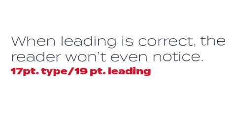
Leading or line spacing is critical to setting professional-looking type that's easy to read. Leading should be set tight, but not too tight.
A good rule of thumb is to start with a leading that’s two points higher than the point size of the text. This won’t always be right, but leading can be adjusted most easily from there.
Tracking an Kerning
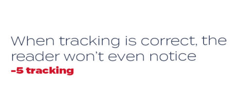
Correct letterpsacing, called tracking, also hleps make the type easy to read. Outside of headlines, it is usually acceptable to use the default tracking.
The term tracking refers to overall letter spacing for groups of letters and entire blocks of text. The term kerning refers to selective letterspacing between pairs of characters.
Do
Use a leading that is 2 points higher than your type size as a starting point.
Track or kern text out when certain letter spacings seem inconsistent.
Do Not
Create too much space between lines of text that are meant to be read together.
Track out long blocks of text.
Track out Handelson. Cursive is meant to connect letters when used.
Typesetting

Sample Typesetting
Pay attention to each font's role within the brand and try to be consistent within each composition.
Breakdown of typesetting
Eyebrow
Matrole Regular; Lyceum Red; 20 pt; Leading 0; Tracking 0;
Lead-in
Termina Black; Oxford Blue; 10 pt; Leading 0; Tracking +325;
Headline
Handelson-one; Lyceum Red; 36 pt; Leading 0; Tracking 0;
Accent
Termina Black; Oxford Blue; 40 pt; Leading 37; Tracking 0;
Payoff
Matrole Regular; Lyceum Red; 10 pt; Leading 0; Tracking +10;

Sample Typesetting in use
Here is an example of a typsetting in action
Depending on the size and layout of your design, font sizes will probably need to differ from what is shown here. However, if you follow the relative size and weight ratios, you should be in good shape.
Do
Use varieties of font size and colors to create hierarchy in the design.
Do Not
Start by drawing a frame and trying to make text fit into a frame. If the frame is meant to work, it will be easily added at the end.
Use the same size type for every instance.
Typesetting Continued

Sample Typesetting
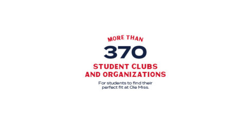
This is a particularly good typesetting for statistical information.
Sample Typesetting in use
Notice the relationship between the number and how the text leads to the number.
Do
Use high impact statistics to craft these typesettings
Need to see more?
Here is a deeper look at how we approach typography, and other brand elements.