Logos
Our university is represented at the highest level by our logos and marks.
Consistency and prominence in all our communications.
These marks act as a signature, an identifier, and a stamp of quality. This section guides on how, when, and where to use each of our marks.
Identity assets must not be manipulated, altered, or modified for use other than entities. Only use the color combinations shown in this section.
Overview of logo use
Primary Logo
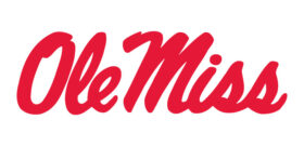
Ole Miss Script
The Ole Miss script is our primary identifying logo. It’s the mark that most people outside of our community associate us with. It’s also the primary mark that represents the university in our marketing, advertising and admissions materials. In addition, it’s the basis for all of our sub-brand logos, which are detailed later in this section.
Formal Logo
Lyceum Crest + UM Wordmark
This mark is the primary mark for formal communications, and the secondary mark for other communications (used near addresses and contact information on the back of pieces, for example). It is also available to any academic entities who don’t feel comfortable using the Ole Miss script as a primary identifier.

University Seal
As an identity mark, the university seal is reserved for formal documents and communications from the university chancellor.
Ole Miss Script Usage

Lyceum Red
The handwritten nature of the script feels warm, personal and approachable, much like our university community.
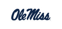
Oxford Blue
Switching the script color to one of our other primary colors is acceptable. Make sure you choose the color that works the best with your design.
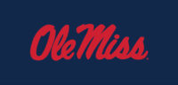
Lyceum Red on Oxford Blue
Classic red on blue is always great to use when engaging with our alumni. Always be aware of how much red and blue is being used overall in the design. If blue and red are both heavily used in the design, a white script may be the best option.

Magnolia White
Any situation where red is the primary color used in a design, or if the background is dark. The white script always pops off a dark background.
Do
Make sure that the clear space around the logo is the height of the “O.”
Make sure the script logo is at least .625 inches in all uses.
Do Not
Outline the script.
Avoid these mistakes when using the script logo.
- Never stretch, skew or rotate the logo.
- Never create new color combinations, even with the primary brand colors.
- Never add effects such as drop shadows and bevels.
- Never change the proportion or arrangement of the logo’s elements.
- Never use a non-designated color for the logo.
- Never add additional elements or create your own lockups.
- Never change the fonts in the wordmark.
- Never place the logo on a background with inadequate clear space or contrast.
Have usage questions? Submitting a design for review?
We are here to help get your project over the line.
UM Crest + UM Wordmark
Horizontal Logo
This is the preferred use of this logo. We do not use the crest in Oxford Blue and text in Lyceum Red.

Stacked logo
Sometimes suing a stacked version of the university crest lockup is a better choice. All color and usage rules apply to the stacked logo.

Lyceum Red and Magnolia White
If using a dark background, this option is great.

Oxford Blue
Rarely used, but acceptable. The best use is in print when you have limited colors to work with.

Magnolia White
The white option is always good for a dark background.
Lyceum Red
Rarely used, but an acceptable option in limited cases.
Do
Use this logo for more formal communications.
Keep a minimum clear space equal to the height of the inner oval.
Keep it above the minimum size of 1.25 inches wide or 120 pixels wide.
Do Not
Deviate from the color options listed above.
Logo Lockups
Lockups are created within University Marketing and Communications. Do not make a lockup yourself.
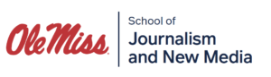

Primary sub-brands
Essential, highly visible sub-brands.
Secondary sub-brands
Entities that are directly tied to a primary sub-brand.
Endorsed entities
Entities that may uniquely identify their offers.
If your department does not have an official lockup, please reach out to Marketing and Communications to have yours made.
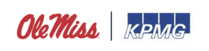
Co-Branded Entities
Co-branding occurs when the university partners or collaborates with another brand that has its own identity, and this partnership needs to be demonstrated clearly.
Each co-branding case will have a unique set of circumstances that will determine the position of the logos. In some cases, it may be more important to lead with Ole Miss, while in other cases it may be more important to emphasize the partner entity.
In either case, a relative balance should be maintained between the two logos. This includes making sure they feel about the same size, even if they’re not exact. Each logo should each have some clear space, but it’s okay to use a little less than you normally would. Use a rule line to help establish separate spaces, because while this is a partnership, there are still two distinct entities.
University Seal
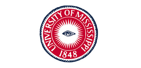
University Seal
This seal can only be used with University Marketing and Communications approval
Think the University Seal is what you need? Contact our branding folks for help.