Graphic Elements
We have some graphic elements to incorporate into designs to really make them pop.
Vintage Frames

Numbered Statistic
A great option for showcasing a program’s ranking.
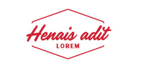
Classic Style
Rarely used, but a great way to showcase a single word that can define your objective.
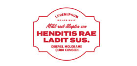
Qualitative Statistic
Some brag points need a bigger space. this is a great space for that.
Do
Use frames when they will benefit the design.
Have Marketing and Communications help you craft a frame.
Do Not
Use a frame without planning every word.
Use frames as a primary setup for typesetting. Most of the typesets do not need frames.
Use frames if you are not familiar with any principles of graphic design.
Underlines

Option One

Option Two

Option Three

Option Four

Option Five

When to use an underline
These underlines are vector graphics that can easily be scaled, colored and adjusted to work with different sizes of type.
Need the files? Reach out to our Brand Services team for help.
Do
Use to highlight keywords when the design allows it.
Use bold font styles of the Termina typeface.
Use underline colors that are different from the text color.
Do Not
Use more than one underline in one block of type.
Use multiple underlines on one page.
Underline an entire phrase.
Use with Handelson, Matrole, IBM Plex Sans, or IBM Plex Serif.
Photo Strips
Inspired by views of campus from the Grove, vertical photo strips are a dynamic visual element. Metaphorically, they represent the different perspectives and views within our community – literally and figuratively – and speak to the idea that while we all see things a bit differently, we find cohesion when we come together.

Timeline Markers
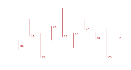
Timeline Structures
Use a timeline to tell a story, or break up the line segments for wayfinding or pull quotes.
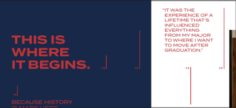
Timeline Markers in use
At their simplest, lines from the timeline can be used as embellishments, vertically ascending or descending on the
Mississippi State Outline

Using Imagery
Use imagery that allows the personality and the whole person's face to shine.
The state outline can be used as a container for photos, as a frame for typographic constructions, as a shape to fill with color, or as a simple graphic component to layer with other visual elements.
Duotone Photography

Light Duotone
Follow these steps to create lighter duotones
Open the image in Adobe Photoshop.
2. In the menu bar, go to Image > Mode > Grayscale.
3. In the menu bar, go to Image > Mode > Duotone.
4. In the pop-up menu, set the Type to Duotone.
5. Change the dark tone to the color of your choice. Light colors do not give the best results, as the tonal range from light to dark is limited.
6. Change the light tone to White.
7. When satisfied, click OK.
8. Go to Image > Mode > RGB for digital applications, or > CMYK for print.
9. Export or Save As the image in the appropriate file format.

Dark Duotone
Follow these steps to create darker duotones
Open the image in Adobe Photoshop.
2. In the menu bar, go to Image > Mode > Grayscale.
3. In the menu bar, go to Image > Mode > Duotone.
4. In the pop-up menu, set the Type to Duotone.
5. Change the dark tone to Black.
6. Change the light tone to White.
7. When satisfied, click OK.
8. Go to Image > Mode > RGB for digital applications, or > CMYK for print.
9. Export or Save As the image in the appropriate file format.
10. Import the image to Adobe InDesign.
11. In the Effects panel, set the Blend mode of the photo to Multiply.
12. Place the photo over a color field. The color will appear to replace the white, due to the Multiply effect. If necessary, this color can be easily changed without going back into Photoshop.
Woodcut Icons
These icons add to the overall vintage feel of living in Oxford with Ole Miss as the backdrop. While these are not available to the general public, we are happy to work with you to incorporate some into your designs.



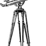





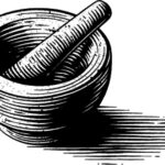



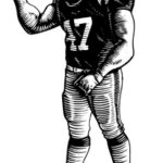






Want to incorporate a woodcut icon into your design?
We are happy to add one to your design during the brand review process.
Need to see more?
Check out these videos for a more in-depth look at our brand.